


Overview
While working at Fusion Medical Staffing, a company that focuses on recruiting and staffing travel nurses and other medical professionals, I chose to make it my goal to research and test the potential for one new feature concept per quarter. With the permission of my manager and department executive, I chose to test new features I felt could be beneficial to the company in some way or form. This project was the first of those tests. For this feature, I looked at ways to compare jobs while searching among the postings on Fusion's website.
Goal
This project's goal was to discover a feature, not currently on the roadmap, that could make the end user's experience smoother and quicker, as well as, help them feel more confident about the jobs they're reviewing and choosing.
Role
-
Product Design
Duration
-
3 Months
Programs Used
-
Figma
-
Maze.co
Problem
CURRENT WORKFLOW
How can we improve a user's search?
-
A user sees a job they think they may like.
-
To view the full scope of job details, they must click into the job card. (Figure 1)
-
To continue viewing jobs, they must go back to the search and go through the same steps.

(Figure 1. Fusion Medical Staffing - Job Details Page)

Fusion Medical Staffing’s users are spending valuable time scrolling through our assignment offerings and clicking in and out of job cards. (Sometimes viewing new positions while on break at their current assignment.) If they are looking at multiple jobs, it becomes hard to compare jobs quickly because they're unable to read descriptions side-by-side. Clicking back and forth constantly can become repetitive and cumbersome, causing users to feel overwhelmed and experience decision fatigue, leading to drop-offs.
PROPOSED SOLUTION
I identified a trend among e-commerce sites offering a comparison mode for viewing product details side-by-side, aiding in shopping. None of Fusion's healthcare staffing competitors currently provides this feature. Given FMS's shopping-like experience, I explored whether this feature could expedite our travelers' goal achievement.

Research
How do we build this the right way?
To better understand the idea of a comparison tool, I researched:
-
Proven UX/UI best practices
-
How e-commerce and other sites were implementing this idea
Research Methods Utilized
-
UX/UI Best Practices
PROVEN BEST PRACTICES
First, I started with research into best practices based on studies done by the Nielsen Norman Group*. (Figure 2)
*The Nielsen Norman Group is a globally trusted team of UX experts, dedicated to providing reliable guidance and practical skill-building for design and research professionals.

(Figure 2. Key details to keep in mind from the Nielsen Norman Group.)


"COMPETITIVE" ANALYSIS
Because no other medical staffing agency had implemented a comparison feature on their website or app, I looked towards e-commerce and other sites I've seen using this tool. Those included: Apple, Costco, Target, and Zillow.
Apple
Apple allows users to compare up to three products from a related category (i.e., computers/laptops, phones, or headphones/earbuds). (Figure 3)


(Figure 3. Screenshots of Apple's comparison feature)


Costco
Costco allows users to compare up to four products of any type. Only available on the web for desktop, not available on the web for mobile or the mobile app. (Figure 4)
(Figure 4. Screenshots of Costco's comparison feature)
Target
Target allows users to compare two products from any search. Only available on the mobile app, not on the web. (Figure 5)
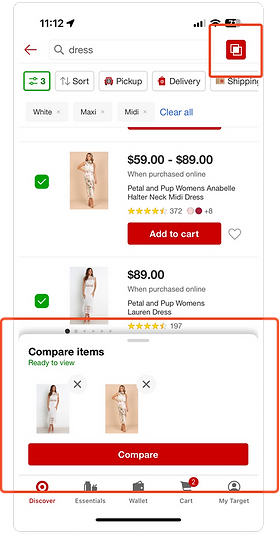

(Figure 5. Screenshots of Target's comparison feature)
Zillow
Zillow allows users to compare Saved Homes only. Users can compare up to five homes at the same time on web or the app. (Figure 6-7)


(Figure 6. Screenshots of Zillow's web comparison feature)


(Figure 7. Screenshots of Zillow's mobile app comparison feature)
Solution
Deliverables
-
Wireframes
How will it look and function?
Based on my research, I decided to design two different options to test on users, using all of the best practices I discovered. My hope with creating two designs was to better understand our users while giving me room for improvement.
WIREFRAMES
Option 1 — Compare Mode
View job differences side-by-side
Users can compare up to two jobs after turning on the compare mode and selecting jobs.
PROS
-
Job cards stay the same height, and visibility isn’t obstructed
-
No horizontal scrolling is required on mobile, so users always see the jobs they’re comparing
CONS
-
The option to turn the mode on is subtle enough that it may be lost on some users
-
Limits the user's ability to compare
Option 2 – Omnipresent Compare Option
Compare more jobs
A user would not have to turn on a compare mode. The compare option would always be visible on the job cards, and a user can compare up to four jobs.
PROS
-
Fewer clicks to compare
Ability to compare more jobs
CONS
-
Extends job card height, leading to fewer jobs visible at a time.
-
Requires horizontal scroll on mobile/not all jobs are visible at the same time


(Figure 8. Option 1 – Compare Mode)


(Figure 9. Option 2 – Omnipresent Compare Option)
Validation
How can we confirm interest?
Based on the designs, I created working prototypes. Then, using the Maze platform, I deployed these prototypes in a survey sent to travelers at the end of 2024 with a goal to recruit 20–24 testers.*
*Survey participants were rewarded with $20 Starbucks gift cards for their completion.
PROTOTYPES
Deliverables
-
Prototypes
SURVEY & USER TESTING
Testers were asked if they had visited our site in the past to understand how well they knew our current product. They were shown a prototype for one of my design options, asked to select jobs, view their differences at the same time, and apply to one of the jobs. Testers were asked three more questions after completing/attempting to complete the task:
-
On a scale of 1-5 (5 being the easiest), how easy was it for you to use this feature?
-
If any, what parts of this design did you find difficult to use?
-
If any, what parts of this design do you feel worked well?
Next, they were asked to do the same steps/questions for the second design option. Once they completed the following steps for both prototypes, they were asked if the feature was something they would find useful in accomplishing their goals on our site
-
If they answered yes, they were asked which option they preferred and why.
-
If they answered no, they were asked why they felt it wouldn’t be helpful.
Lastly, they were asked to provide any further feedback in an open-ended format.

Results
Deliverables
-
User Test Results
SURVEY & USER TEST RESULTS
Overview
-
12 testers started the survey.
-
The response rate dropped to 8 for design Option 1-related questions.
-
The response rate dropped to 7 once users reached the Option 2-related questions.
-
-
6 of 7 users said the feature would help them accomplish their goals and expressed positive feelings.
-
3 users chose option 1 as more helpful.
-
3 users chose option 2 as more helpful,
-
The 1 user who said it was not helpful took the survey on an Android mobile device (which was later found to be buggy) and did not allow screen or voice recording.
-
-
100% of testers had visited fusionmedstaff.com in the past.
-
Prototype success rates were inconclusive.
-
The majority of users were unable to successfully complete tasks.
-
A bug caused issues for users who took the survey on a phone instead of a laptop, even though the directions explicitly stated to take the survey on a laptop or desktop device, not a mobile device.
-
Feature feedback
-
Design Option 1
-
They felt selecting more than two jobs would be nice
-
They liked the slider for viewing differences only
-
They liked the side-by-side comparison view
-
The overall response to the concept was positive
-
-
Design Option 2
-
They wanted to be able to rotate the phone to see jobs side-by-side better without scrolling
-
They liked not having to “turn on” comparison mode via a button
-
The overall response to the concept was positive
-
Due to issues with the survey and a lower-than-expected completion rate, I was unable to confirm the feature interaction. However, with the positive feedback I received, a comparison feature would be a welcome option for our travelers.

Reflection & Next Steps
WHAT I LEARNED
-
Add more questions in surveys to understand users' feelings around the current experience before getting into prototype tasks. These question could look like:
-
On a scale from 1-5 (5 being the easiest), how easy is it for you to compare jobs on fusionmedstaff.com or the Fusion Medical Staffing app?
-
(If they answer 3 or below) Why did you give this rating?
-
-
Have you used a compare feature, like what is offered on Target's mobile app, Zillow, or apple.com?
-
If you have, is this something you would find useful in your job search?
-
Can you elaborate?
-
-
-
Simplify the prototypes
-
Increase “QA” before survey release
-
Better clarify that prototype surveys work on laptops only, not mobile devices
-
Adjust survey promotion timing*
*The survey was promoted via email at the end of the year during the holiday season. I expected higher participation due to the Starbucks incentive and increased free time. Turnout was lower than anticipated.
WHAT COMES NEXT
-
Send out another non-incentivized, simple survey (without a prototype) to confirm there is a desire for a comparison feature and get numerical data on the current experience. Include different questions like:
- How would users rate the current search experience today?
-
What words would they use to describe the current process?
-
What time of day/when are they looking at open assignments?
-
Add the feature to our backlog to further improve the design
-
Potentially do a few moderated prototype tests with users (based on business' budget)
