

Overview
IronBourne Fitness is a CrossFit-style gym in the Lincoln, Nebraska area. They are continuously striving to improve the gym experience to retain old members and welcome new ones. They are the only CrossFit-style gym in their section of the city, but there are many other competitive gyms within the area.
Goal
IronBourne was looking to revamp its website to make it more competitive, user-friendly, and inviting. Their current site did not respond well to size changes, and the design did not fit with their new logo. They wanted to resolve this by creating a responsive and cohesive design to help better promote brand recognition. They wanted more transparent class times and prices, so people would get excited to come in and try out their services. They also started offering new services that they had not yet marketed, and wanted to include those in the revamp. Furthermore, the following questions needed to be answered to understand how best to keep existing members and entice new ones:
-
What features are most important to prospective gym members?
-
How do current members stay notified with what’s going on at the gym?
-
What features on a website would help create a better sense of community?
(This was a DesignLab UX Academy course project. The final results of this project were never utilized by the actual gym.)
Role
-
UX and UI Design
Duration
-
4 Weeks
Programs Used
-
Figma
-
InDesign
-
Illustrator
-
Maze.co
Research
To make sure their website contained the right kind of information and was competitive I did research on IronBourne Fitness’ competitors - CrossFit Lincoln, CrossFit Wolfbone, and Fly Fitness; customer interviews with three women - the majority gender of members - who were a prospective gym member (for an outside opinion), a current gym member, and a past member; and lastly customer surveys released via Slack and SurveySwap.
Research Methods Utilized
-
Competitive Research
-
1:1 Customer Interviews
-
Customer Surveys
Deliverables
Community
After doing an online survey, as well as three remote customer interviews, I found that gym websites are often one of the first places potential gym members visit to decide if they want to try a gym out. This means they need to make a good and memorable impression. The website needs to convey the feeling of the gym. IronBourne Fitness is a group-class-focused gym, and they strive to foster a great sense of community. When asked what community means to people the top answers were:
SUPPORT
ACCOUNTABILITY
LIKE-MINDED PEOPLE
FRIENDSHIP
RESPECT
ENCOURAGEMENT
(Figure 1. What Community Means)
Current and past members of the IronBourne agree that community is one of their top reasons for staying members. However, currently their website does not convey this sense at all. Prospective members are looking for a fun and unintimidating place to attend, but they cannot see this right now. People feel a better way to show community would be to show images of real members in the actual facility working out, helping each other, and attending events and challenges.
Features
When questioned about the importance of features on a gym’s website, people explained that the most important features to them included, first and foremost, transparent, competitive, and comparable levels of pricing. On par with the pricing, people overwhelmingly said that they wanted it to be transparent whether there is a free trial period and how long it lasts, as well as what’s necessary to start that trial. Another option that was requested that I didn’t originally think about was information about dropping in for a class if a person is from out of town. Next, class descriptions and schedules were also important. People wanted to make sure they understood what type of exercise they would be participating in and if it would fit into their busy schedules. After that, coach bios were listed as important as well. People want to see who will be leading their classes. They want to make sure they are qualified and relatable. One feature that participants in the survey also found to be important was a general FAQs page. Lastly, two features that I thought people would be interested in that were actually found to be lower priorities were testimonials and blogs. The majority of people found testimonials unnecessary, because they preferred to look at reviews from outside sources. They felt testimonials on websites were skewed because businesses are not likely to put reviews on their site that would be negative. For those people who did like testimonials, they looked for ones from people they knew and preferred detailed testimonials that illustrated the gym’s atmosphere well.
Some further information I did not originally think about that was brought to my attention through this research was: a section where members can send complaints and/or suggestions, a section with any information on necessary equipment and suggested dress codes, and a list of gym equipment that’s used in the workouts. This information would fit well under the FAQs page.
Three other features that are obligatory are contact/location information, social media links, and any links to sign-up forms. People found that the location of a gym was a large reason for choosing a particular gym, so again, this needs to be transparent. Also, since people stated that blogs were not necessary, but rather that they got most of the information about events and challenges from word-of-mouth or social media, links to social media need to be prominent on the website to promote engagement. Lastly, people not only said they wanted to see the class schedule on the website, but also said they were happier when they could sign-up for and cancel classes straight from the website. Unfortunately, the hosting site that IronBourne Fitness uses does not allow this type of plug-in and they use an outside app for sign-ups and detailed class programming. This means that it will be necessary to have a link that allows members to sign-in easily. If possible a link for people to download the app they use, Wodify, would be beneficial as well, so people could go straight to the app rather than opening the site up each day.


(Figure 2. IronBourne Fitness Current Site)
Pain Points/Frustrations
First and foremost, many gym websites, especially local gyms’, are not mobile-friendly. In a world where mobile is very important, responsiveness is something that needs more focus. Many gym-goers check schedules on the fly, which means they have to be able to see everything on their phones. Next, many people expressed frustrations with not knowing how to go about canceling a membership. While the gym does not want to give a big presence to this negative act, people trust a business more when they are upfront about everything, so somewhere on the site, there should be information about this potential process. Trust leads to better relationships and longer followings. As for the current IronBourne Fitness site (Figure 2), all of these things were found as pain points, as well as a lack of consistency, poor UI design, and some confusing options that lead nowhere, such as the login function that doesn’t actually lead to the sign-in app Wodify.
The Solution
The website needed to convey a better sense of support, encouragement, and fun. I could do this by making the website design less aggressive and adding more real imagery of the gym members and facility. I needed to make the site responsive and include the following features/information to be more transparent: detailed pricing, class descriptions, class schedules, coach bios, FAQs, contact information, social media links, and a link to the outside app for class sign-up. The FAQs needed to include: trial period information, drop-in information, dress codes, cancellation information, and equipment information. More consistency within the site’s UI was a must to help with readability. Also, all things on the website that were unnecessary needed to be deleted to make the site less confusing and minimize clicks.
THE IRONBOURNE FITNESS MEMBER
Based on the information I gathered from my surveys and interviews, I was able to create a persona (Figure 3) and empathy map (Figure 4) for the most common type of gym member at IronBourne Fitness. This persona helped keep me grounded throughout the project on what was actually needed to fit this member’s needs.
Meet Sara Tucker:
Sara is a mother of two small kids and a third-grade teacher at a local grade school, so she’s got a very busy schedule. She’s always been a healthy person, but with the arrival of her second child, she finds it harder to focus on her health than she used to. She needs extra motivation and people to keep her accountable. Sara wants to find a gym she can join with people who will help her with both of these things, so she can maintain healthy habits long term. In her search for a new gym, Sara also wants to find a place that offers reasonably priced memberships that can be customized to fit her unpredictable home and work schedules. Lastly, she wants to find a gym that offers a wide variety of exercise classes, so she can maintain her interest over a long period of time and know that she’s working out her entire body.

(Figure 3. IronBourne Fitness Member - Sara Tucker Persona)

(Figure 4. IronBourne Fitness Member - Sara Tucker Empathy Map)
Information Architecture
FEATURE ROADMAP
After doing the research, I had a better understanding of what types of functions and features a potential and current gym member would need when going to IronBourne's site. With that in mind, I wrote down a list of features based on their level of importance. This helped me know what needed to be included in my site design.
Deliverables
-
Feature Roadmap
PRIORITY LEVEL 1
Must-Have
-
Responsive Design
-
Navigation Menu
-
Membership Pricing
-
Free Trial
-
Class Descriptions
-
Class Schedules
-
Services
-
About Us
-
Coach Bios
-
FAQs Section
-
Wodify App Log-in Link
-
Facility Info/Photos
-
Social Media Links
-
Contact Information
PRIORITY LEVEL 2
Nice to Have
-
Map of Location
-
Photos of Gym Members
-
Testimonials
PRIORITY LEVEL 3
Surprising and Delightful
-
Wodify App Download
-
Suggestions/Complaints Section
PRIORITY LEVEL 4
Can Come Later
-
Video on Homepage
SITE MAP
With the necessary information and features determined, I was able to create a site map that showed how someone could navigate through IronBourne Fitness' website (Figure 5).

(Figure 5. IronBourne Fitness - Site Map)
Interaction Design
DESIGN PATTERNS
Before I started designing the layout and assets for this site, another thing I thought about was common design patterns. For this step, I researched competitor websites, Dribbble, and other resources to find design patterns that worked well to solve the problems IronBourne Fitness' current site was suffering from. The design patterns I focused on were Expandable Text, Information Cards, and Price Comparison Charts (Figure 6).
Deliverables
-
Design Patterns


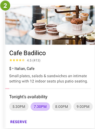
(Figure 6. Design Patterns - (1) Expandable Text, (2) Information Cards, and (3) Price Comparison Charts)
WIREFRAMES
Now that I had a good grasp on who my audience was, how they’d interact with the site, and good design practices, I was able to create low-fidelity wireframes (Figure 7) for the necessary web pages, including: the Home, About Us, Meet the Team (coach bios), Additional Services, FAQs, Class Descriptions, Membership Pricing, and Contact pages. These wireframes would work as a rough guide to know how pages should be laid out and how assets should function. I made wireframes for the desktop, iPad (not shown), and the mobile site, as my research proved that having both was very important to members.


(Figure 7. IronBourne Fitness Low-fidelity Wireframes)
To download and view all of my low-fidelity wireframes, click here.
BRANDING
IronBourne Fitness had recently hired a designer to create a new logo for them, so the UI design of the site was based on the style of that logo. I wanted to create a more cohesive design throughout the website to help strengthen the gym's brand recognition and help it be more engaging. Based on feedback during the research phase, I decided to brighten the website up, so it was more inviting and less aggressive. Below is the basic branding style information. (Figure 8)

(Figure 8. IronBourne Fitness Branding Style)
HIGH-FIDELITY WIREFRAMES
After settling on a branding style, I moved on to applying this style to my original layouts to create high-fidelity wireframes (Figure 9). These would become the wireframes that made up my prototype for user testing. (For the sake of time, the prototype testing was limited to the desktop version only. In the future, it would be wise to do user testing of the mobile site as well.)


(Figure 9. IronBourne Fitness Initial High-fidelity Wireframes)
Iteration and Implementation
Deliverables
-
Prototype
PROTOTYPE USER TESTING
After creating a high-fidelity version of the site, I wanted to test people's reaction to it by making a prototype. By using Figma’s prototyping capabilities, I was able to create a “working” version of the site. After doing this, I created a test through Maze.co (Figure 10) to find out more information about how well certain design elements of my site were working and if the new design had helped create a more welcoming experience that better portrayed the gym's overall sense of community. The user test consisted of four tasks and one open-ended opinion, as well as some rating scales along the way for how easy the tasks were to complete. The tasks participants were tested on were very basic and focused on finding features that my research revealed were most important to gym goers. Throughout the tasks, participants tested navigation, text within expandable cards, and membership pricing comparisons. (Figure 11) Here is a list of the tasks tested:
Task 1
Find and view membership pricing.
Task 2
Find class descriptions and check out class details.
Task 3
Find and view the coach bios.
Task 4
Find the FAQs section and answer questions.
Final Opinion
Explain overall experience, if there was a good sense of community, and provide any frustrations.

(Figure 10. IronBourne Fitness Maze.co User Test)


(Figure 11. Assets Tested During User Testing Tasks)
Participants
Eight people between the ages of 25 and 35 participated in my test. Some of the participants were the same as those in the 1:1 interviews.
Test Goals
-
Participants can easily navigate throughout the site.
-
The difference between membership packages is easy to understand.
-
Class descriptions and times are easy to view.
-
Extra questions are easy for participants to answer.
My Hypothesis
-
Participants will be able to navigate between pages easily.
-
Participants will be able to understand the difference in membership pricing easily.
-
Participants will have no issues with drop-downs on class description cards.
-
Participants will find the FAQs helpful and easy to access.
USER TESTING RESULTS

Task 1
Find and view membership pricing.

Task 2
Find class descriptions and check out class details.

Task 3
Find and view the coach bios.
Task 4
Find the FAQs section and answer questions.
Was it clear what each membership plan included?
The average answer was 4.5.

While exploring, were you easily able to find the scheduled times for the classes you looked at?
The majority answer was Yes.

Was it clear which classes each coach would be leading by looking at their bios?
The average answer was 4.4.

How easy was it for you to find answers to the questions you had?
The average answer was 5.

(Figure 12. User Test Results)
Feedback
Was this site easy to navigate, and did you feel there was a sense of community at this gym?
(Please feel free to share any thoughts you have about things you think can be improved.)
-
"It was easy to navigate."
-
"There are some minor accessibility problems with your use of lime green for some text."
-
"Easy to navigate. Sense of community was ok - nice to have photos of people."
-
“Overall, a wonderful design! I would say for the class info, instead of just having the chevron be what causes the info expansion, maybe consider the text?"
-
“Very clear and concise.”
-
“I felt that the site provided an overall sense of the gym community.”
-
“I felt it was easy to find my way around the webpage. The pictures of the coaches and members make this look like a friendly, yet challenging atmosphere.”
-
“Yes, the site was very straightforward and easy to navigate...”
REVISIONS
Based on the feedback I received from the participants, I decided to change some areas of lime green text to a secondary shade of green that was more accessible. I also added a few new options to navigate to the subpages under About Me, so that users were more aware of where to find them. Lastly, I made a note that the click range of the class description drop-downs needed to be made bigger for the next round of prototyping and user testing. After speaking to participants who rated Tasks 1 and 3 lower, I discovered that they felt my test did not allow them enough time to judge the information, so they gave it a lower rating.
The following mockups (Figure 13) include the final revised wireframes. To download and view all of my high-fidelity wireframes, click here.


(Figure 13. Revised Responsive High-fidelity Wireframes)
FINAL UI KIT
The UI Kit was slightly revised after the prototype testing. This final UI kit includes foundational elements (Figure 14), navigation components (Figure 15), and several other frequently used components (Figure 16).

(Figure 14. IronBourne Fitness - UI Kit Foundational Elements)

(Figure 15. IronBourne Fitness - UI Kit Navigation Components)

(Figure 16. IronBourne Fitness - UI Kit Additional Components)
Next Steps
If, down the road, IronBourne Fitness decided that they would like to move forward with utilizing this website design, these are the next steps that would need to be implemented:
-
Look into adding a comments and suggestions section or page.
-
Add a section where members can download the Wodify app directly onto their phones.
-
Look into creating a video of the gym and current members for the homepage that continues to foster that sense of community that defines IronBourne Fitness.
-
Retest both desktop and mobile once further changes are made.
