


Overview
KAUS insurance (a fictitious company) has been in the insurance business for 30+ years using a business-to-business model, but is now looking to transition into the direct-to-consumer model. With the rise of the internet and personal devices, they want to focus on attracting a younger demographic.
Goal
To fulfill this objective, they want to create an easy-to-use and understand e-commerce site, as well as a new, clean, and modern identity. (The site must be able to accommodate business insurance options in the future.)
(This was a DesignLab UX Academy course project for a fictitious company.)
Role
-
UX and UI Design
Duration
-
6 Weeks
Programs Used
-
Figma
-
InDesign
-
Illustrator
-
OptimalSort
-
Maze.co
Research
To make sure their website is easy to understand and competitive, I did research on Kaus’ competitors - Progressive, State Farm, Liberty Mutual, Lemonade, and Allstate; customer interviews with three participants who were young adult insurance owners; and a customer survey released via Facebook and Slack.
The competitive analysis showed what was working well for other companies and what wasn’t, the customer interviews helped pinpoint good experiences and pain points, and the customer surveys helped show further pain points, as well as purchasing habits, which helped verify that I was targeting the right audience correctly.
Research Methods Utilized
-
Competitive Research
-
1:1 Customer Interviews
-
Customer Surveys
Deliverables
The research concluded that the biggest frustrations people found when purchasing insurance were: feeling overwhelmed, not being able to understand the terminology or what they’re buying; wanting to get the best deal, but feeling like their time is being wasted comparing options; and dealing with poor customer service. Their biggest frustrations after purchasing insurance were: policies are too expensive; it’s hard and slow to file a claim; they're unable to access policies online; there’s no clear contact information for customer service; and policies are still confusing and not well explained.
The research also concluded that the best practices for insurance companies were: affordable prices, transparency with fees, no confusing terminology, easy-to-navigate websites, and access to agents over the phone. The best features provided by companies were: price comparison tools, insurance term glossaries, online policy access, online claim filing, and online bill pay. One particular asset that many of the interviewees mentioned as being unimportant and rarely, if ever, used was a mobile app.
THE KAUS CUSTOMER
Based on this information I was able to create a persona (Figure 1) and empathy map (Figure 2) for a potentially common type of Kaus customer. This persona helped keep me grounded throughout the project on what was actually needed to fit the Kaus customers’ needs.
Meet Marcus Johnson:
Marcus grew up on a farm in rural Nebraska, just outside of Lincoln. His mom was a nurse, and his dad was a banker. They taught him the value of hard work and quality time.
Growing up, Marcus decided to follow in the path of his mom and go to medical school to become a PA. He recently graduated and bought a new Toyota 4Runner to celebrate. He’d love to look into buying a home down the line too, now that he’s out of school and has a stable job, but his work schedule keeps him incredibly busy, and he needs to pay off his student bills.
Because of his new purchase, Marcus is looking to find a new insurance policy that fits him. He doesn’t have a lot of off-time, though, and what time he does have, he wants to spend with friends and family, not insurance hunting. He also wants to get good coverage, but wants to make sure it’s the best option for his budget since he’s trying to save up.

(Figure 1. Kaus Customer - Marcus Johnson Persona)

(Figure 2. Kaus Customer - Marcus Johnson Empathy Map)
Information Architecture
FEATURE ROADMAP
After doing the research, I had a better understanding of what types of functions and features a potential customer would need when purchasing insurance from Kaus. With that in mind, I wrote down a list of features based on their level of importance. This helped me know what needed to be included on my site design.
Deliverables
-
Feature Roadmap
PRIORITY LEVEL 1
Must-Have
-
Account Creation
-
Responsive Design
-
Search Bar
-
Navigation Menu
-
FAQs Section
-
List of All Types of Personal Policy Options
-
Prepackaged Bundle Deals
-
Detailed Plan Breakdowns
-
Quote Generator
-
Checkout Form
-
Account Creation
-
Secure Bill Pay
-
Claim Filing Form
-
Healthcare Network Search
-
Find an Agent
-
Contact Information
PRIORITY LEVEL 2
Nice to Have
-
About Us
-
Term Glossary
-
Ideal Plan User
-
Resume a Previously Started Quote
-
Competitive Company Comparison Tool
-
Educational Blog
PRIORITY LEVEL 3
Surprising and Delightful
-
Language Change
-
Automatic Payment Setup
-
Claim Tracking
-
Social Media Links
PRIORITY LEVEL 4
Can Come Later
-
Chat Box
-
List of All Types of Business Policy Options
-
Real-time Policy Cost Calculator
-
Mobile App
CARD SORTING
Next, I needed to do some more research to further understand how potential customers thought about insurance regarding wording, so I created a card sorting activity. Participants were given 30 cards (terms that would be used on the website) (Figure 3), asked to sort them into different groups/categories, and lastly asked to give those categories a name. The participants for this activity were all young adults, between the ages of 25 and 35, who owned insurance or were in the market to purchase insurance. Here are the cards that were provided:


(Figure 3. Terms used in the card sorting activity)
The results from this activity showed me that the top four groupings were: Types of Insurance (100%*), My Account (70%*), Policy Pricing (60%*), and Help (60%*). These groupings would be used to create the site’s main navigation.
Also, because Types of Insurance had a large number of cards that fell under it, participants broke it down even further into subcategories: Vehicle, Property, Personal, and Other.
People seemed to struggle with deciding where to put Discover Your Network, and Policy Bundles was surprisingly put under Policy Pricing several times rather than unanimously with the other types of insurance policies, as I had hypothesized. So to solve these issues, I changed Discover Your Network to Your Health Network Providers and placed it under My Account. Then I put Policy Bundles under both Policy Pricing/Savings and Insurance Types, because it was most frequently matched with those two options.
* Percentage of consensus among participants.
SITE MAP
With the groups and categories determined I was able to create a site map (Figure 4). This site map shows how someone will be able to navigate through the website. The turquoise sections are sections whose placement was questioned after card sorting - Your Health Network Providers and Policy Bundles.

(Figure 4. Kaus Insurance Site Map)
Interaction Design
FLOWS
The next step after working on information architecture is interaction design. In this part of the project, I focused on how potential customers would interact with Kaus’ site. To illustrate this, I created task (Figure 5) and user flows. To view the user flow click here.
Deliverables
-
Task Flow

(Figure 5. Kaus Task Flow)
DESIGN PATTERNS
Before I could start thinking about designing the layout and assets for the site, another thing I had to think about was design patterns. Design patterns are reusable/recurring components that designers use to solve common problems in user interface design. For this step, I wanted to research competitor (and other) websites to find design patterns that worked well and looked visually interesting in hopes of adapting them for Kaus’ site. Some of the main sites I looked at were: Progressive, State Farm, Allstate, Manomano, and Liberty Mutual. The design patterns I focused on were Navigation, Search Functions, Agent Finders, and Progress Bars. Here were the take-aways from my research:
Navigation
-
Keeping the location of the login in the top right (and the hamburger menu in the top left on the mobile app) is easier for users to recognize due to consistency between different sites.
-
Visual illustrations - such as size, color, and icons - help users identify paths faster, so they can move through the site more quickly.
-
A pop-out menu on desktop allows the many options to be larger and may be easier to read.
-
Visual Hierarchy is extremely important in menus that offer lots of options.
-
Breadcrumbs are helpful for sites that have lots of pages.
Search
-
A search function should be present at the top of the page for those users who know exactly what they’re looking for (it should not be hard to find).
-
An icon and/or button should be used to further designate the search area.
-
Popular searches and auto-complete would be beneficial in helping users find what they want faster.
-
Grouping searches may be helpful for policy types that have many subcategories.
Agent Finder
-
Listing different methods of contact next to the agent’s name is important.
-
Many people do not speak English as a first language, so listing agents’ language options may be helpful to some users.
-
A photo of the agent makes them seem more personable and less intimidating.
-
Multiple search parameters other than zip code may be helpful for users looking for specific agents’ information or different locations.
Progress Bar
-
Progress bars are extremely important when getting an insurance quote; without them, users may tend to drop out of the steps because they feel like they’ll never finish.
-
A percentage graph is visually appealing and engaging, but may still leave some anxiety for the user as they don’t know how many more steps are left to go in the process.
LOW-FIDELITY WIREFRAMES
Now that I had a good grasp on who my audience was and how they’d interact with the site, I was able to create low-fidelity wireframes for some of the basic web pages, including: the Home page, Types of Insurance page, Policy Pricing page, My Account page, and Help page. (Figure 6) These wireframes would work as a rough guide to know how pages should be laid out and how assets should function. As I went about creating my wireframes, I realized that some changes would be necessary on the main navigation. The card sorting had given me an idea of what to call each main category; however, the terms determined were too long to fit in the design. Because of this, Types of Insurance was changed to Insurance Policies, and Policy Pricing was shortened to Pricing. To view and read the annotations that go with the wireframes below, click here.
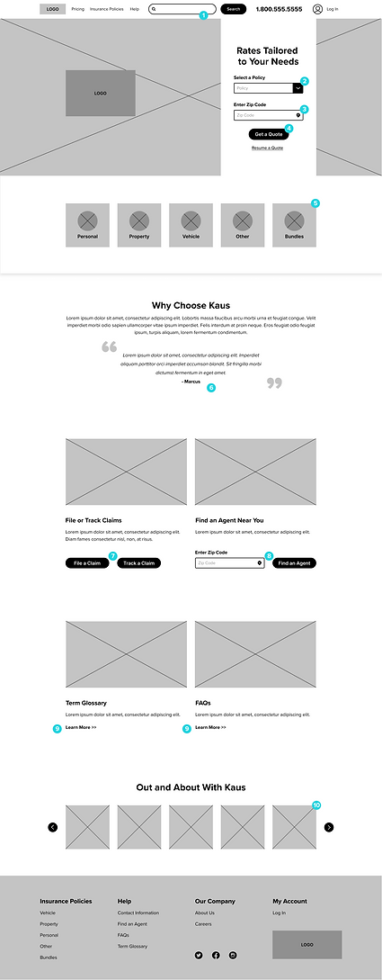


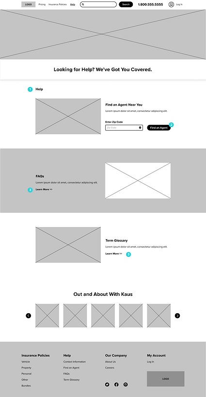
(Figure 6. Kaus Insurance Low-fidelity Wireframes)
User Interface Design
LOGO & BRANDING
With the research, information architecture, and interaction design all mapped out, I could now move on to the UI design of the project, which included one of the main goals: creating a new, clean, and modern identity.
The new Kaus logo (Figure 7) is friendly and modern. The primary icon is a ‘K’ created by a heart and a link intertwined together - referencing the security and care.
Deliverables
-
Logo and Branding

(Figure 7. Kaus Insurance Logos)
The brand's colors are blues and turquoises, colors that represent health and loyalty - two very important parts of Kaus’ mission. Rounded edges and circular shapes are incorporated within the design to bring a sense of comfort to the audience. Any imagery used is diverse and warm. Below is some basic branding style information (Figure 8) and elements from the UI kit (Figures 9-11), as well as the responsive high-fidelity frames (Figure 12) I created in place of the low-fidelity wireframes for the Home page.

(Figure 8. Kaus Insurance Branding Style)
UI KIT

(Figure 9. Kaus Insurance UI Kit Foundational Elements)

(Figure 10. Kaus Insurance UI Kit Navigational Components)

(Figure 11. Kaus Insurance UI Kit Additional Components)
RESPONSIVE HIGH-FIDELITY WIREFRAMES


(Figure 12. High-Fidelity Responsive Frames - [left to right] Desktop, Tablet, Mobile)
Iteration and Implementation
Deliverables
-
Prototype
PROTOTYPE USER TESTING
The final phase of this project was creating and testing a prototype to find out what the next steps should be. By using Figma’s prototyping capabilities, I was able to create a “working” version of parts of the site. After doing this, I created a test through Maze.co (Figure 13) to find out more information about how well certain aspects of my design were working. The user test consisted of four tasks and an open-ended opinion. With the test link, participants were able to rate the understandability of elements used within the tasks and give their overall opinion of design, ease of function, and transparency. Participants tested drop-down menus, a calendar date-picker, radio buttons, and secondary buttons. (Figure 14) Here is a list of the tasks tested:
Task 1
Request a quote from the homepage.
Task 2
Fill out the first form page and move to the next step.
-
Click in text fields to auto-fill.
Task 3
View bundles and savings on the corresponding form section.
-
Move to the next step without adding extra savings and policy bundles.
Task 4
View competitor pricing options from the final quote.
Final Opinion
Have participants explain their overall experience and provide any pain points.

(Figure 13. Maze.co User Test)


(Figure 14. Assets Tested During User Testing Tasks)
Participants
Seven people between the ages of 25 and 35 participated in my test. Of this group, three were male, four were female, three were renters, four were homeowners, and all seven were insurance owners of some type.
Test Goals
-
Participants can easily understand and follow the steps to get a quote.
-
The process of getting a quote is quick and easy.
-
Participants are happy with the transparency of the quote Kaus offers.
My Hypothesis
-
Participants will easily recognize that Kaus is an insurance company.
-
Participants will find the home page easy to navigate and sections with corresponding links easy to comprehend due to consistency with other websites.
-
Participants will find the quote form easy to move through.
-
Participants will appreciate the transparency of Kaus’ quotes.
USER TESTING RESULTS
On a scale from 1 to 5 (5 being the easiest) - Was it easy to find where to get a quote and how to start it?
The average answer was 4.6.


On a scale from 1 to 5 (5 being the easiest) - Was this form easy to fill in?*
The average answer was 3.6.


On a scale from 1 to 5 (5 being the best) - How would you rate the calendar option?*
The average answer was 3.6.

On a scale from 1 to 5 (5 being the easiest) - Did it seem like it would be quick and easy to add more savings?
The average answer was 4.8.

On a scale from 1 to 5 (5 being the easiest) - Was it easy to view competitor prices?
The average answer was 5.

*Notes: Glitches and Issues - Task 2 Results Skewed
- Unfortunately, people experienced a weird bouncing issue where the page would quickly scroll up and down when clicked.
- Many participants struggled with the click size of the calendar pop-out on Task 2 when on the “Fill in the Form: Part 1” task.
- One participant was kicked out of the test.
Feedback
Open-Ended Question Asked: What are your thoughts on this overall interface?
(Examples: Were you easily able to tell what type of company Kaus was from the home page? Was anything confusing or misleading? Were links easy to distinguish?)
-
All participants found the site was easily distinguishable as an insurance provider
-
“...Very clean and clear cut...”
-
“...pages contained the right amount of information and were clear on how to proceed to the next step...”
-
“...it was super easy to navigate.”
-
“...The interface was easy to navigate and user-friendly.”
-
“...Links were very easy to distinguish.”
-
“...Very simple and clean.”
-
“It’s intuitive and smooth as silk.”
REVISIONS
Home Page
-
Step numbers were added to the Get a Quote module.
-
A title was added above the icons that helps better distinguish that they are links to pages with more information on the type of policy.
Form Fields
-
Calendar was left as is - after discussing the issues had with each tester, the problem was not due to the understandability of the action, but a glitch.
-
Better distinguished text field active states vs inactive states, with the use of color.
Below are the high-fidelity frames after these revisions were made. (Figure 15) To view all of my wireframes for desktop, mobile, and tablet, click here.


(Figure 15. High-fidelity Frames With Revisions)
Next Steps
To move forward with this project, these are the next steps that would need to be implemented:
-
Add and refine copy throughout the site
-
Create other Insurance Policy pages based on the Vehicle Insurance page
-
Finish the entire Policy Pricing quote form
-
Finish designing other missing pages based on finalized branding
-
Conduct more usability testing
-
Hand off to the development team
