

Overview
Ripe Now (a fictitious company originally called Season It) is a new company that wants to better promote seasonal eating to help people save money while lowering the environmental impact of the food industry. The company wants to shine a light on seasonal eating’s benefits by providing an app that maps out this produce and shows users how to incorporate it in their diets.
Goal
The goal for this project is to help promote shopping for seasonal produce and make it easier and more fun for people to do so by creating an easy-to-use app. With my research, I wanted to answer the following questions:
-
What benefit of eating seasonally motivates people most?
-
What is the most efficient way to map seasonal produce information so it can be easily understood by users?
(This was a DesignLab UX Academy course project for a fictitious company.)
Research
For this project, I chose to do a potential user survey, an in-person focus group, and competitive research. The survey focused on where and how often people shop, motivational reasons for shopping, cooking knowledge and interest, and cooking app and site usage. The focus group consisted of a group of women who are the primary shoppers and cooks of their households. It also involved these types of questions, but allowed the participants to feed off of each other's responses. This focus group is what revealed that the original name, Season It, was not working and that Ripe Now was a better option. Competitor research revealed that there are not a lot of apps out there with seasonal produce information as their primary goal. The competitors I focused on were Seasonal Produce Guide, Kuri, and Eat Seasonal.
My research revealed that many people do not fully know what produce is in season in their area. They also do not know that seasonal produce can 1) be healthier, 2) taste better, 3) be better for the environment, 4) support local farmers, and even 5) save consumers money. Oftentimes, it is inconvenient to research produce, how to pick it, store it, and cook it, so people tend to avoid it.
TOP REASONS FOR WANTING TO EAT SEASONALLY


After informing people about the benefits of seasonal eating, research showed that the top two reasons people wanted to start eating seasonally were that they could save money and that the food they bought would taste better. People would like access to seasonal produce information; however, this information alone was not enough to make them want to download an app. Any app with this type of information needs to include more features, and because more people buy produce to use when cooking, the most popular addition would be recipes.
With this knowledge in mind, I turned my research towards features and recipe-based platforms. Many cooking blogs and websites force people to scroll through long pages of stories and biographies that they find unhelpful and obnoxious. This information solidified that recipes listed on this app needed to be all in one place and easy to see without an excessive amount of scrolling. There was also a strong interest in knowing how to choose produce at the store, how to store it at home, and its nutritional value. Some of the competitor apps to Ripe Now included this information, but these apps linked users to outside sources in their web browsers. People didn't care for this. They didn't want to be forced out of the app. Ripe Now needed to include this information in a succinct manner, but maybe make links to it on a different page as the recipe, within the app itself. Because the increased health benefits of seasonal produce seemed to excite people, they needed to be included somewhere in the app.
For future purposes, an idea was brought up that they would appreciate it if the app could tell them which stores, markets, and local farms they could purchase these seasonal items from. Right now, this is beyond the scope of the project, but it is a very good idea for further research at a later point. Along these same lines, there was interest in being able to filter recipes several different ways, including by searching for recipes that did not include certain allergens and searching for recipes that include ingredients you currently have in your fridge.
THE CONSCIENTIOUS CHEF
Based on the information I gathered from my research, I was able to create a persona (Figure 1) for the most common type of user of this new app. This persona helped keep me grounded throughout the project on what was actually needed to help meet the client's goals while keeping potential users' frustrations to a minimum.
Meet Anna Davis:
Anna Davis is a stay-at-home mom with two young kids. She loves to cook and wants to make sure her family eats healthy and enjoys mealtime. On the weekends, she enjoys shopping at the local farmer's markets and spending time in her garden with the kids, teaching them about the plants. Because her family only currently has one income, she does her best to save money while grocery shopping. She’s heard that shopping and eating seasonal foods offers numerous benefits and is interested in making it a habit.

(Figure 1. Ripe Now - Anna Davis Persona)
Information Architecture
FEATURE ROADMAP
After doing the research, I had a better idea of how this app would need to function and what features it would need to include to help users feel that it was worth their time. Here is a list of those features based on their level of importance. This list helped me know what needed to be included within my application design.
PRIORITY LEVEL 1
Must-Have
-
About Page
-
Individual Produce Page
-
Seasonality Infographic
-
All Recipe Page
-
Individual Recipe Page
-
Recipe Photos
-
Ingredients
-
Step-By-Step Instructions
-
Filter by Region and Season
-
Profile Page
-
Guest Sign-In
PRIORITY LEVEL 2
Nice to Have
-
Favorite Recipes
-
In Season Ingredient Icons
-
Facts and Tips
-
Cook Times
-
Ratings
-
Reviews
-
Annotations
PRIORITY LEVEL 3
Surprising and Delightful
-
Adjustable Portion Size
-
Cooking Level
-
List of Nutrients
-
Baking Tips and Step-by-Step Photos
PRIORITY LEVEL 4
Can Come Later
-
Search by Produce
-
Filter by Cuisine Type/Cooking Time
-
Filter by Fridge
-
Where to Buy
-
Filter by Allergen
Task Flows
With these features in mind, I created a possible main task flow that my persona could follow as she moved about the app. (Figure 2) This task flow helped me understand how my upcoming wireframes needed to be laid out. Here is that task flow:
Anna wants to cook something new for her family this week using seasonal produce. She discovered the Ripe Now! app after talking to some friends about her increasing interest in eating seasonally. She’s headed to the store later this afternoon, so she decides to download the app onto her iPhone to discover what’s in season and find a yummy-looking recipe. Once she finds one, she can add any ingredients she doesn’t have to her shopping list.

(Figure 2. Ripe Now - Possible Task Flow)
Along with the task flow, I also created a user flow to help myself and others understand how someone could navigate throughout the app. To download and view my user flow, click here.
App Mapping
The above task flow helped guide me in how to lay out the entire application. I created an app map to further help me with laying out the wireframes. (Figure 3) I decided to be detailed and include the information from the feature roadmap on the app map as well, to act as a sort of checklist for me, so I wouldn't forget to add something.

(Figure 3. Ripe Now - App Map with Feature Details)
Interaction Design
The next step in my process was to create a logo for the new application. (Figure 4) The final logo is fun and playful, with a sans serif font paired with a script of similar weight. The 'o' within 'now' was illustrated to look like an analog clock and an orange, to represent the time aspect of seasonality and the produce.
The branding style consisted of common colors within produce - greens, yellow, orange, and red, as well as several greys. The main font used throughout the app would be SF Pro in various styles. There would be bright, clear photos of produce items and recipes, and simple icons that are easily recognizable due to consistency with other apps. (Figure 5)
Deliverables
-
Logo & Branding
(Figure 4. Ripe Now Final Logos)

(Figure 5. Ripe Now Branding Style)
WIREFRAMES
Next - with my checklist of features, task flow, and persona information - I was able to create low-fidelity wireframes for all of the screens: the login page, main (home) page, a specific season's produce page, an individual produce information page, an individual produce recipe page, an individual recipe page, a favorited recipes page, account information page, and about page. (Figure 6) Creating these low-fidelity wireframes helped save time when it came time to add content and my brand style into the app. To download and view all of my low-fidelity wireframes click here.


(Figure 6. Ripe Now Low-fidelity Wireframes - not all pages created are shown in this figure.)
Once I was felt these layouts would work well I added color, copy, photos, and branding to the wireframes. (Figure 7) As I made my way through each page some small changes were made to the layout to make sure copy was always readable and navigation was as simple as possible.


(Figure 7. Ripe Now Initial High-fidelity Wireframes - not all pages created are shown in this figure.)
Iteration and Implementation
Deliverables
-
Prototype
PROTOTYPE USER TESTING
After designing all the necessary pages, I created a working prototype that I could test. For this project, because it is a new app that's never been seen before, I decided to test the prototype two ways: moderated and unmoderated. The moderated tests were done both over Zoom and in person. (Figure 8) Participants gave permission for these sessions to be recorded. During these tests the participants completed three tasks and spoke their thoughts and actions aloud as they went. Once the tasks were completed they provided me with any additional feedback. The unmoderated tests were completed via an online test created with Maze.co that was released over Slack. (Figure 9) The tasks for this test were the same. Participants were also asked how they felt about the seasonal infographic on the individual produce item's page, how easy they felt it was to navigate the app, and how likely it would be for them to use the app. Here are the tasks that were completed:
Task 1
Viewing a Recipe as a Guest
Task 2
Creating an Account
Task 3
Saving a Recipe and Adding Annotations

(Figure 8. A Moderated Test of Ripe Now Over Zoom)

(Figure 9. The Unmoderated Test of Ripe Now Via Maze.co)
Participants
Three people participated in the moderated test, and 13 participated in the unmoderated test.
My Goals
-
Participants can easily navigate the app and learn information about produce.
-
Participants can easily understand what season different types of produce are ripe in.
-
Participants find the create an account process simple and quick.
My Assumptions
-
Participants will have no problems understanding how to navigate the app.
-
Participants will enjoy the extra information provided within an individual produce item’s page.
-
Participants will like having the option to enter the app as a guest.
USER TESTING RESULTS
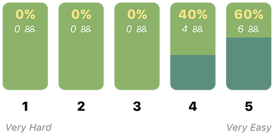
Both types of user tests were insightful and helpful. People navigated through the app easily, and everyone was able to complete each task without fail. (Figure 10)

TASK 1
Viewing a Recipe as a Guest
TASK 2
Creating an Account
TASK 3
Saving a Recipe and Adding Annotations
How easy was it for you to navigate through this app?
The average answer was 4.6.
Would you find an app like this useful?
The average answer was 3.8.

(Figure 10. Ripe Now - User Test Results)
REVISIONS
The feedback and test results were overwhelmingly encouraging and positive. However, some changes were requested out loud by participants, and others were found through viewing how people went about completing the tasks. Below are the final revisions made to the app (Figure 11):

(Figure 11. Ripe Now - Revisions)
These are the revisions I made and why I did so:
A. Some users didn’t want to have to remember a username; they preferred to use their email, so I made it optional and on the same page as the email when creating an account.
B. Because the username was moved to the same screen as email, the password was left alone on a separate page when creating an account.
C-D. The option to create an account was given more emphasis, and the guest view was moved to the sign-up’s original location. Some people felt it was too small originally, so I made this text larger.
E-F. Some users wanted an option for their app to know their location and the month of the year automatically, so this option was added to the month and region scrolling options.
G-I. (For Guest View Screens Only) Rather than making users jump back to the log-in screen to choose to create an account, I’ve given them the option on each of these frames as well.
J. Some users didn’t realize this was a drop-down to a search function, so I added the magnifying glass to help emphasize this feature.
K. Several users kept thinking the months in the infographic were buttons, so I changed them to reflect calendar icons.
L-M. One user wished they could view details of the recipes before going into the actual individual recipe page, so I added a drop-down with basic information.
N. Not many people understood what the icon within the ingredients meant, so I added a description below.
O. One user pointed out that the favorited recipes could get very unorganized quickly if someone favorites a lot. So I’ve added two categories with drop-downs — recipes that currently use in-season ingredients and recipes whose ingredients are out of season — to help users choose what to make.
P. Exactly like the individual produce’s recipe options, they show the new drop-down here as well. The one difference is that the produce item in season is only highlighted in the name of the recipe under that individual produce’s page.
Q-R. It was brought to my attention that the amount of negative space was awkward on the original notes frame, and the back button was odd, so I’ve removed the back button, included an ‘X’ to exit the screen, and made it so that the screen automatically goes back to the recipe once a note is saved.


To see a high resolution pdf of all high-fidelity wireframes, including revised click here.
FINAL UI KIT
Now that I'd made the revisions, I put together a final UI Kit to be used when going forward with the next steps on Ripe Now. The UI Kit consisted of several design patterns, including foundational elements (Figure 12) and components. (Figure 13)

(Figure 12. Ripe Now - UI Foundational Elements)

(Figure 13. Ripe Now - UI Components)
Next Steps
When going forward with this project, the following steps should be taken next:
-
Now that the revisions have been made, another round of user testing should be completed to see if this has the desired effect.
-
Pages and information for all months and seasonal produce need to be added, as well as recipes for each.
-
Adjustable portion sizes/ingredients lists should be looked into.
-
Information on where to buy individual produce locally, such as store names and farmers' markets, should be added.
-
Filtering options should be looked into for cuisine types, cook times, ingredients, and allergens.
-
For baking recipes, step-by-step photos and tips should be included.
